fill'd · Web design, WordPress, Accessibility · 2026
A role-first website for fill'd.
fill’d connects Australian families with local care workers. Care workers after shifts, service providers after staff and registered providers after a network all landed on the same pages and had to work out which parts were meant for them. Everything below follows from fixing that.
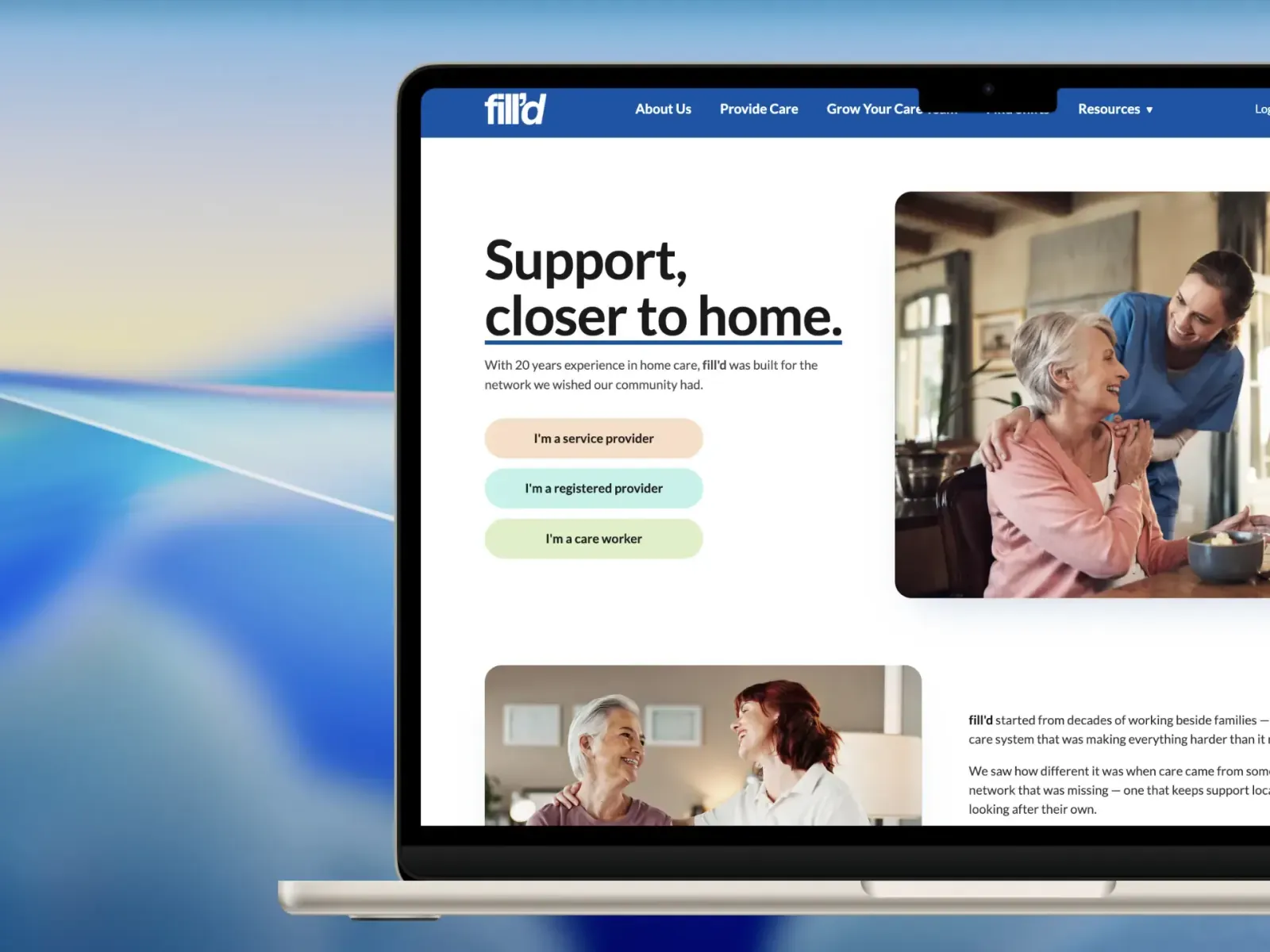
The home page opens by asking which of the three you are, and the rest of the journey follows that answer. Each role gets its own landing, its own colour and its own language, inside one brand rather than three.
Role-first entry, carried through the whole journey
A colour per audience, across the theme and its icon set
Custom WordPress theme — no page builder, no template licence
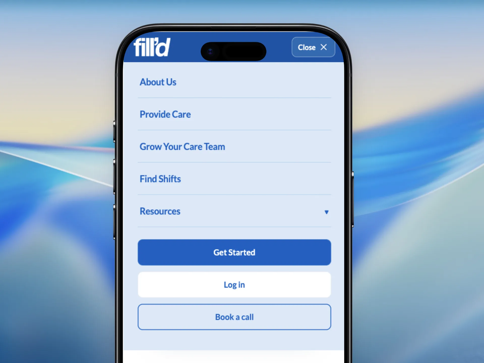
The same three roads on a phone — the menu names the destination rather than the department.
02Help centre
A help centre, not a FAQ list.
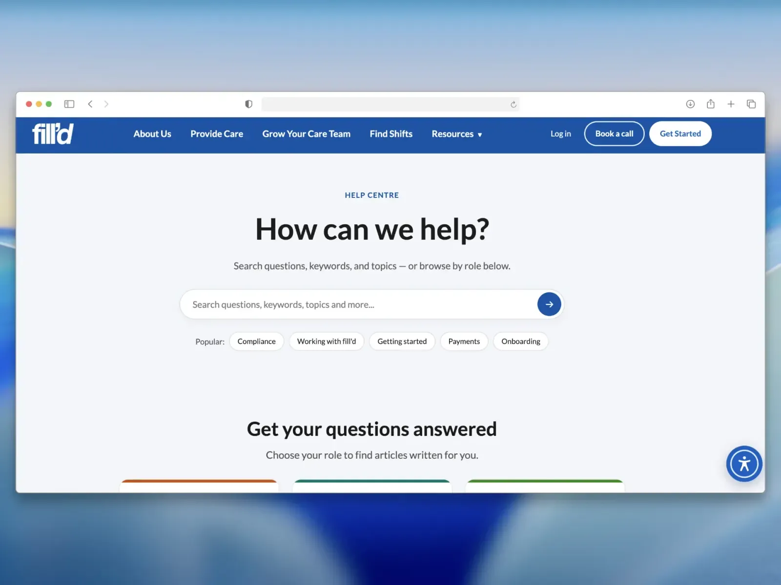
Care is full of questions that do not fit in an accordion. We built a searchable help centre and moved the whole knowledge base into it, grouped by role so nobody reads three paragraphs before finding out they were the wrong ones.
128 articles, imported and structured
Search first, then browse by role
FAQ schema on every article
Search first for the people who know what they want, role cards below for the people who do not.
03Accessibility
Built for the people most likely to need it.
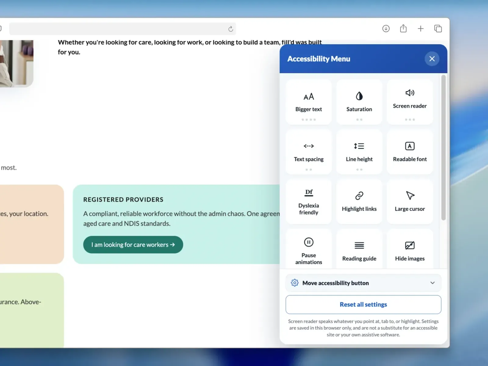
Care sites are read by older people, by carers on a phone between visits, and by people with low vision. We wrote a self-hosted accessibility toolbar rather than embedding someone else's widget — no third-party script, no data leaving the site.
Twelve controls, from text size and line height to a reading guide
Self-hosted OpenDyslexic — nothing fetched from a CDN
A launcher that moves, for anyone it lands on top of
The note at the bottom is deliberate — a toolbar that overstates itself is worse than none.
04Underneath
The parts nobody is meant to notice.
A knowledge base is only worth writing if it turns up in search. The sitemap went from a handful of page URLs to the whole library, and the site is served from the edge rather than from one box.
Every help article in the sitemap, with an Australian locale
AWS Lightsail behind CloudFront
Something like this in mind?
Tell us what you’re launching and we’ll come back with a scope, a schedule and a price.